The Interactive Virtual Tour component lets you turn 360° scenes into immersive, interactive experiences. Use it to place your audience inside a real or virtual space, guide what they explore, and layer in rich interactive content directly within the environment.
- Build virtual tours with one or multiple 360° scenes.
- Add interactive components directly inside each scene.
- Create guided experiences by controlling view positions, navigation and user flow.
- Gate parts of the tour based on user behaviour or progression.
Get Started
You can start building with the Interactive Virtual Tour…
- From your Dashboard: under Projects, Click Interactive Virtual Tour on your Dashboard > Projects, to create a virtual tour project that is ready to configure right away.
- Inside an existing project: Open Building Blocks, search for Virtual Tour, drag the component onto the canvas, and double-click it to start configuring it.
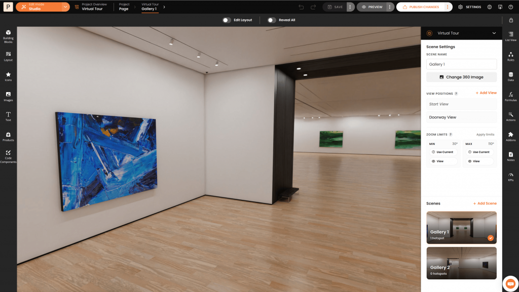
When editing your Interactive Virtual Tour, you can:
- Add content from the menus on the left side of the Studio
- Position content – drag, adjust size and perspective
- Use the settings panel on the right side to configure the current scene and manage your scenes.
The sections below explain these options in more detail.
Add Content
Adding content and interactive elements to your scene is simple — just drag and drop them directly onto the tour.
You can easily build rich interactive tours, by combining different types of content:
- Multimedia content such as images, videos, and text
- Buttons to navigate between scenes or trigger actions
- Interactive components from the Building Blocks library
Position Your Content
Any content you place in the scene can be positioned and fit anywhere within the 360 view.
To position your content, follow this simple order:
- Move – drag content to where it should appear in the scene.
- Adjust size – use the size controls to make your content appear closer or farther away to ensure it fits naturally into the scene.
- Adjust perspective – drag the four corners to match the surface you want to place the content on.
For best results, first get the position and size roughly right, and only then adjust the perspective.
When content is selected, an active settings menu appears with additional positioning options, including the ability to reset the perspective.
Tip: Avoid stretching content too much — choose dimensions that fit the surface you’re placing it on.
Change 360 image
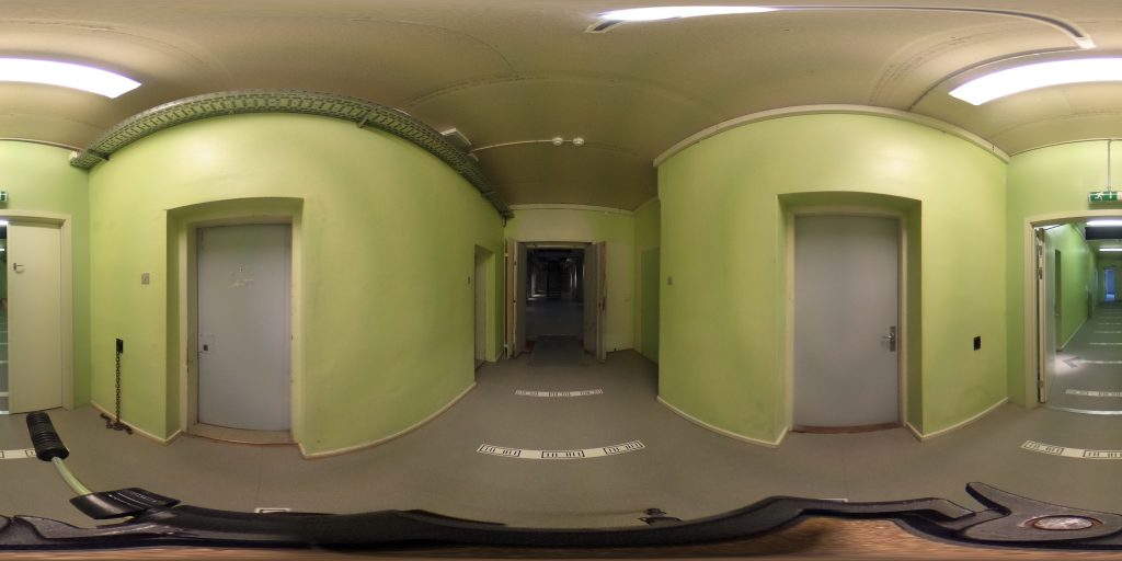
Each scene of your Interactive Virtual Tour needs a 360 image, so when you start working with a new Interactive Virtual Tour, it comes with a single scene with a sample 360 Image.
Types of 360 images
- Equirectangular – an equirectangular image is a single 360 image file, and is therefore a good option to get you started, when testing ideas, or building a first version of your tour.
- Cube Map – a 360 image that is cut into many tiny image files, which are the tiles of your 360 image, often at different zoom levels. This is the recommended option for production, for better performance and a smoother zoom experience.
Simply click Change 360 Image to choose another image for the current scene. You can either choose from our samples or upload your own 360 image. See below how to upload your own.
Note: all of our samples are Cube Maps, so they are production ready, and a great way to get you started.
Upload Your Own
When you are ready to upload your own 360 Images, click Change 360 Image, then click the + Add Image button located in the top bar. Then select the 360 Type.
Add Equirectangular Image
To add an equirectangular image follow these steps:
- Give a name to your 360 Image
- Choose Equirectangular from the 360 Type dropdown
- Click Next
- Drag and drop your equirectangular image from your computer to the “Drag your tiles here” area and wait for the file to finish uploading
- Select your image from the 360 Images list
Add Cube Map
The Cube Map format supports multiple levels which means that it is possible to maintain the image quality even if the user zooms in. The number of levels, number of tiles and the tile size must be configured to match your Cube Map files.
To add a Cube Map, follow these steps:
- Give a name to your 360 Image
- Choose Cube Map from the 360 Type dropdown
- Configure the File Path Pattern: The file path pattern describes how are your tile images located in related to the level and face they belong to. For example, a pattern defined by “{f}/{z}/{x}_{y}.jpg” means there will be a tile located at “t/0/0_1.jpg“, which represents a tile at level 0, from the top face at the 0 x coordinate and 1 y coordinate. The exact mapping from the File Path Pattern to the tile file also has to take into consideration the Cube Map levels configuration, described in the next point. You can use the following wildcard patterns to build your file path pattern:
- {z}: Represents the level of the tile and will be substituted by: 0, 1, 2, 3, etc.
- {f}: Represents a face and will be substituted by the following values: f (front), b (back), u (up), d (down), l (left) and r (right)
- {x}: Represents the current x coordinate of a tile in relation to its face and will be substituted by: 0, 1, 2, 3, etc.
- {y}: Represents the current y coordinate of a tile in relation to its face and will be substituted by: 0, 1, 2, 3, etc.
- Configure Cube Map Levels: Cube Map levels define how many levels is your cube map comprised of. For each Cube Map level you need to define the number of tiles per face and what is the size of each tile. It also needs to follow these requirements:
- All tiles in a level must be square and form a rectangular grid
- The size of a level must be a multiple of the parent level size
- Click Next
- Drag the folder that contains all your tile images, in the format specified in the File Path Pattern and wait for the files to finish uploading
- Select your image from the 360 Images list
View Positions
A View Position is a predefined position of the user and the direction it is facing. It can be the initial position of a scene or it can be a position the user is moved to via an action. View Positions can also be used to create a guided virtual tour among several scenes.
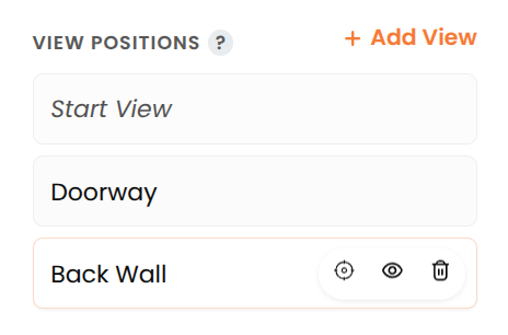
There is always a View Position called “Start View”, which is created by default and cannot be deleted, and is the first view position the user sees when entering the current scene.
To have users navigate to a scene’s View Position, you will use the “Go To…” action described here.
Adding View Positions
To add a new View Position in your scene, follow these steps:
- Pan and zoom the current scene to the location where you want to create the View Position
- Click the + Add View button
- Give a name to your View Position – this is important to later refer to it when using the “Go To…” Action
Update A View Position
To update an existing View Position, follow these steps:
- Pan and zoom the current scene to the location where you want to update a View Position
- Mouse over the View Position item that you want to update, and click on the crosshair icon.
Zoom Limits
You can set how far users can zoom in and out. This helps prevent zooming beyond levels where the scene’s 360 image loses quality.
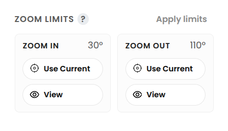
To set the zoom limits for the current scene:
- Zoom in or out to the view you want to use
- Click Zoom In Use Current or Zoom Out Use Current
To test the zoom limits for the current scene, click Apply Limits to toggle your current zoom settings in the scene your are editing.
Manage Scenes
In the Manage scenes section, you can:
- Click + Add Scene, then choose or upload a 360 image and create a new scene in your tour
- Sort scenes to change their order and define the starting scene
- Clone or delete a scene from the three-dot menu on each scene
Tip: A clear scene order can also make your tour easier to build and navigate, especially for guided or story-based experiences.
Navigation
To have users navigate between the scenes of your Interactive Virtual Tour you need to use the following “Go To..” action.
Use this action when you want to navigate to either another View Position or another Scene.
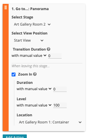
To configure the “Go To…” action, follow these steps:
- Select Scene: Select the scene to navigate to. In case you select the same scene as the current one, the “Go To…” action will only pan to the new View Position, selected bellow.
- Select View Position: Select what is the View Position you want users to look at.
- Transition Duration: The transition duration behaves differently depending on the selected target scene:
- If the the target scene is the same, the transition duration is the time it takes to look at the target location.
- If the target scene is different, the transition duration is the time it takes to fade in the destination scene.
- Zoom In: In case the target scene is different, select the Zoom In transition when exiting the current scene.
- Duration: What is the duration (in seconds) of the zoom in animation.
- Level: How much to zoom in, from 0 (min zoom) to 100 (max zoom).
- Location: What is the Zoom In location from the current scene. You can select among: current mouse/tap position, view position and hotspot containers.