The Widget Component will enable you to add custom HTML/JavaScript/CSS visual widgets in your Interactive Experiences.
This can be useful if you want to have very specific requirements for styling and behaviors. Some examples of how you can use the Widget Component are:
- A custom image slider
- Embed an external lead form
- Create a specific animation
How to configure
After adding your Widget Component into your project, double-click it to open its settings.
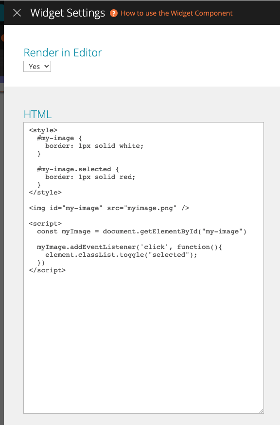
Use the HTML setting to insert your HTML, Javascript, and CSS code. Here is an example of what you can insert in the HTML setting. This example prints an image that can be selected/deselected. When selected, the image will feature a red border.
<style>
  #my-button {
    border: 1px solid white;
  }

  #my-button.selected {
    border: 1px solid red;
  }
</style>

<button id="my-button">My Button</button>

<script>
  const myButton = document.getElementById("my-button")

  myButton.addEventListener('click', function(){
    myButton.classList.toggle("selected");
  })
</script>
You can also use the Render In Editor setting to choose if you want the component to be rendered in the Editor, or just live. It can be useful to avoid rendering in the Editor if you are using a heavy script, which might slow down the Editor. Since the component is being rendered with each change it might become too complex for a smooth experience.