What is the Products Feature?
The Products Integration feature allows customers to display their products seamlessly and directly within the editor. Our platform is designed to be compatible with Google standard product feeds. If you have already submitted your product feed to Google, you can easily reuse the same feed.
This feature simplifies the process of showcasing products on Dot.vu projects, offering a more maintainable alternative to manually creating product metadata.
Add a Catalog
The Products Feature works with the Catalogs add-on, acting as a compact database for presenting data. Clients can establish a catalog linked to their product feed to utilize the Products Feature effectively.
Setting Up the Products Feature:
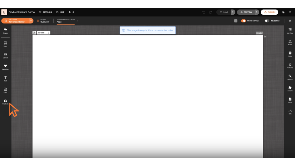
Enable Products Feature:
- Access the sidebar and enable the “products” setting.
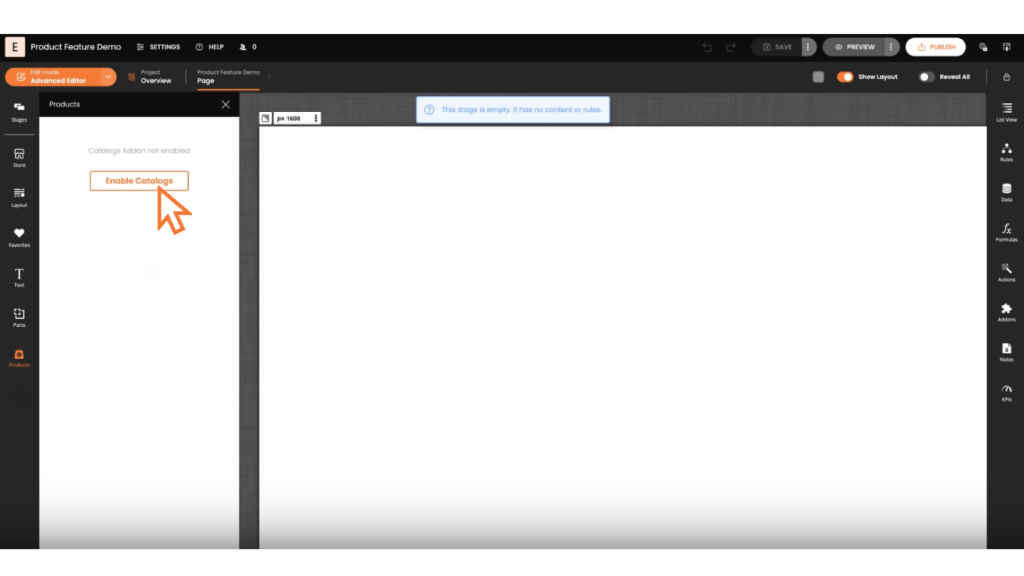
Enable Catalogs Add-on:
- Ensure the Catalogs add-on is enabled.
Select and Set Up a Feed:
- Choose a product feed to connect with.
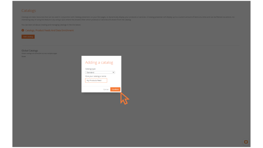
Create a Catalog:
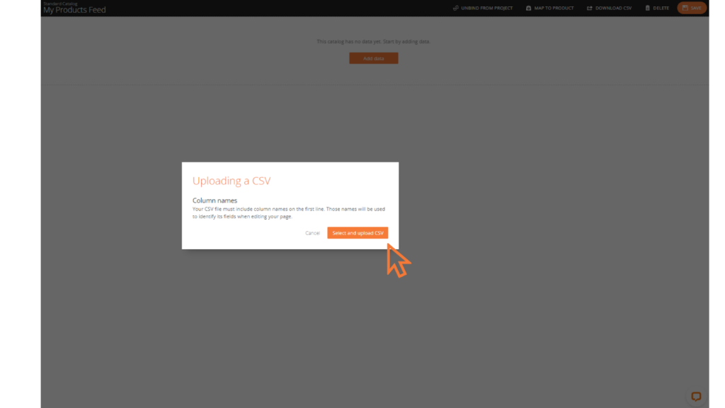
- Add a new catalog and upload your product data (e.g., via CSV file).
Map a Catalog to Products
Once the catalog is set up, map the essential fields such as ID, product name, description, URL, images, price, and gender to correspond with the product data. This step enables the Products Feature to recognize and utilize the catalog’s product information effectively.
Search and Use a Product
Search for Products:
- Users can search for products within the catalog by name.
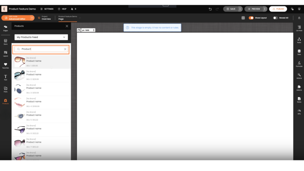
Add Products to Projects:
- Drag and drop products into the project.
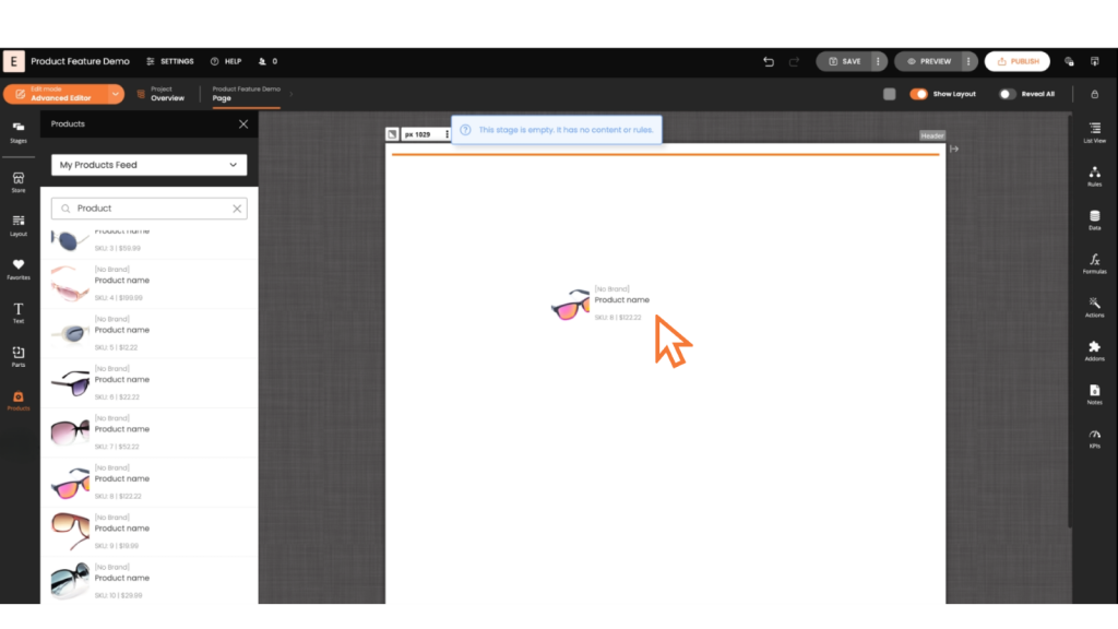
- Choose display options such as “small product” as needed.
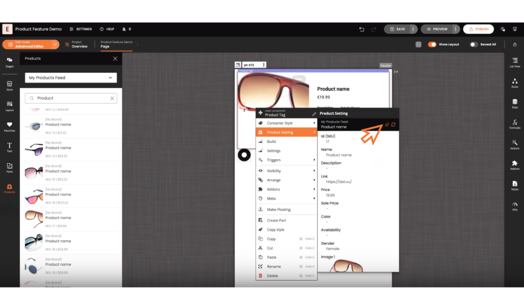
Manage Products
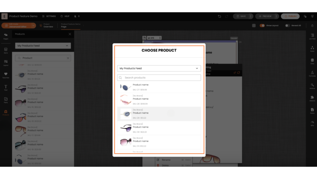
Swap a Product
- Right-click on a product within components to manage it.
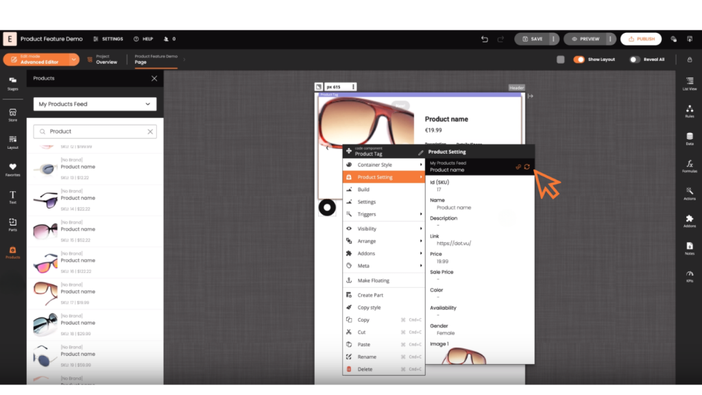
- Swap products by selecting an alternative product from the catalog.
Unlink a Product
- Right-click on a product within components to manage it.
- Unlink products to detach them from the product feed and manually input data.
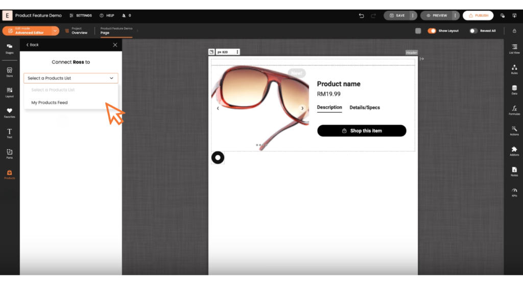
Resolve Not Found Products
If a catalog is disabled or cannot be found, use the “Resolve” feature.
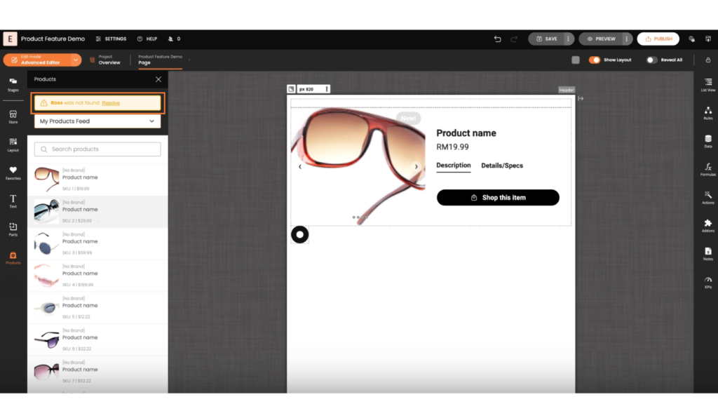
Once you click on the “Resolve” feature, you can reconnect or enable the necessary catalogs. This feature ensures continuous access and utilization of product data across projects.
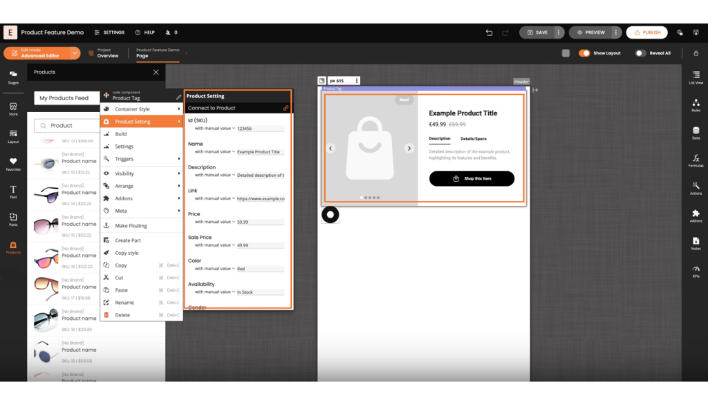
Product Datafields
Each product component has data fields available for advanced use cases. Product Datafields can also be used for creating advanced customization such as logging or add to cart or wishlists.
You can use product datafields along with the Triggers, Conditions and Actions for advanced customization of your projects.
Connecting Product Component to Google Analytics
To enhance your tracking capabilities, you can connect the product component (product ID and product name data fields) to the Google Analytics addon. This allows you to send specific product data to Google Analytics for better insights.
If you want to send the product name and ID to Google Analytics when a product is clicked, follow these steps:
- Identify the product component in your system.
- Connect the product ID and product name data fields to the Google Analytics addon.
Understanding Product Components
These components are designed to showcase products effectively, each with unique features and functionalities. Below is a detailed description of each type of product component.
1. Product Card
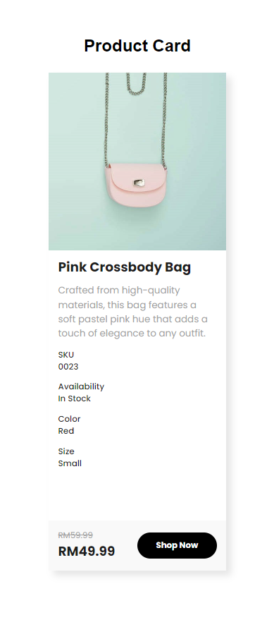
The Product Card is a compact component designed to highlight essential product details. It includes:
- Product Image: A visual representation of the product.
- Title: The name of the product.
- Metadata: Additional information about the product.
- Price: The cost of the product.
- Shop Now: A call-to-action button that directs users to purchase the product.
2. Product Display
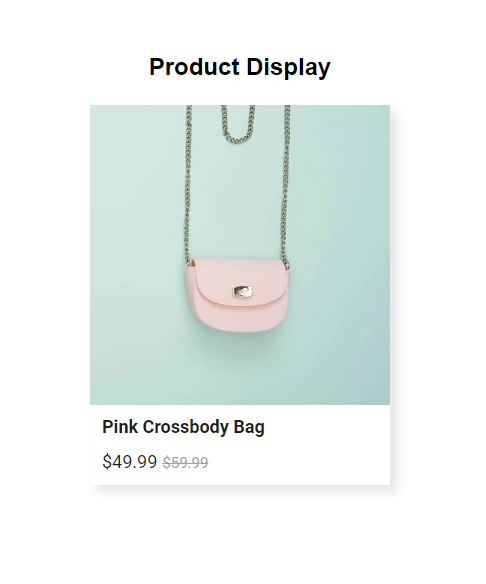
The Product Display focuses on a minimalistic approach, showcasing only the critical elements:
- Product Image: A clear and attractive image of the product.
- Title: The name of the product.
- Price: The cost of the product.
3. Product Highlight
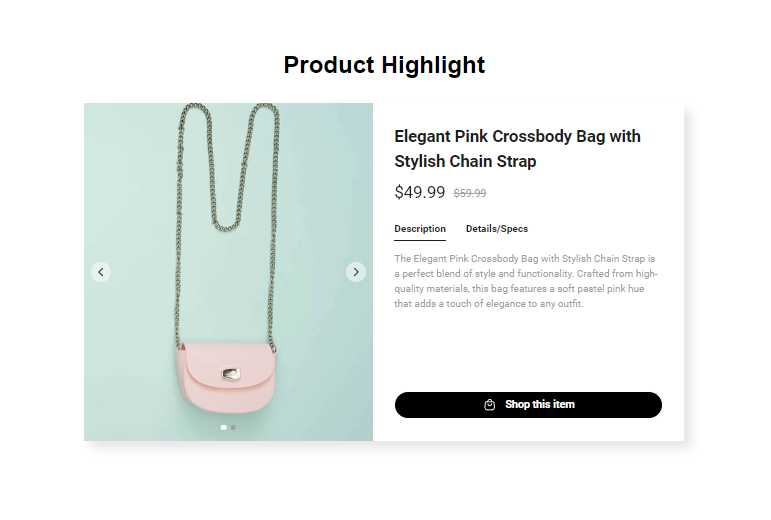
The Product Highlight offers a comprehensive view of the product, including:
- Product Images: Multiple images to give a detailed view.
- Title: The name of the product.
- Price: The cost of the product.
- Description: A brief summary of the product’s features.
- Details: Additional specifications or information about the product.
- Shop Now: A call-to-action button for purchasing the product.
4. Product Hotspot Card
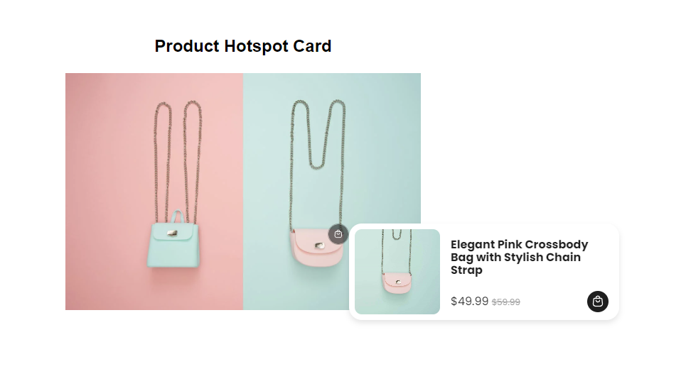
The Product Hotspot Card adds interactivity to an image:
- Hotspot: A clickable area on the image.
- Card: When clicked, a card appears showing:
- Title: The name of the product.
- Image: A visual of the product.
- Price: The cost of the product.
- Shop Now: A button to purchase the product.
5. Product Hotspot Tile
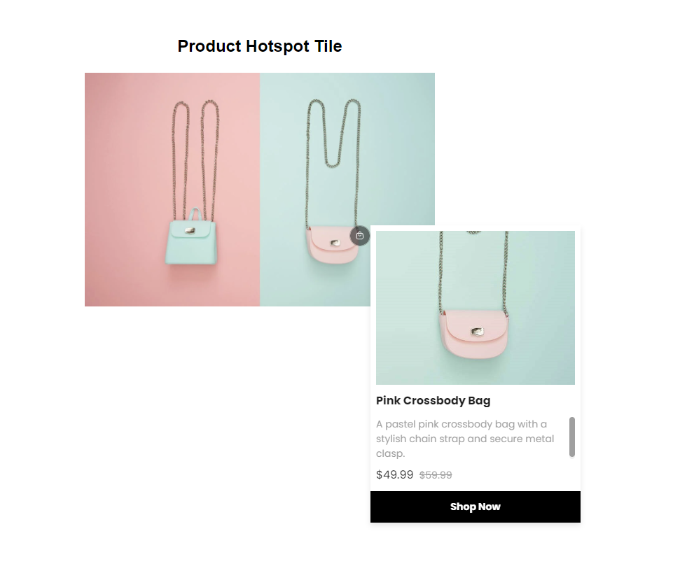
Similar to the Hotspot Card, but with a different format:
- Hotspot: A clickable area on the image.
- Tile: When clicked, a tile appears showing:
- Title: The name of the product.
- Image: A visual of the product.
- Price: The cost of the product.
- Shop Now: A button to purchase the product.
6. Product Popup Card
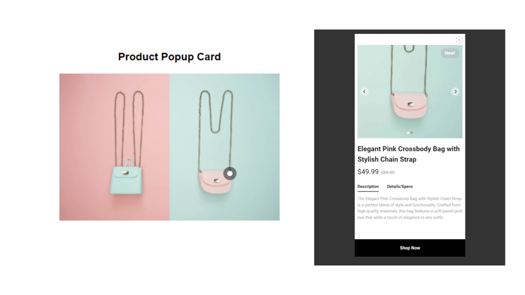
The Product Popup Card provides an immersive experience:
- Hotspot: A clickable area on the image.
- Popup Card: When the hotspot is clicked, a popup appears with:
- Title: The name of the product.
- Image: A visual of the product.
- Price: The cost of the product.
- Description: A brief summary of the product’s features.
- Details: Additional information about the product.
- Shop Now: A button to purchase the product.
7. Product Popup Tile
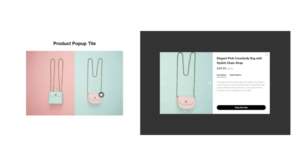
Similar to the Popup Card, but in a tile format:
- Hotspot: A clickable area on the image.
- Popup Tile: When the hotspot is clicked, a popup appears with:
- Title: The name of the product.
- Image: A visual of the product.
- Price: The cost of the product.
- Description: A brief summary of the product’s features.
- Details: Additional information about the product.
- Shop Now: A button to purchase the product.
8. Product Tag
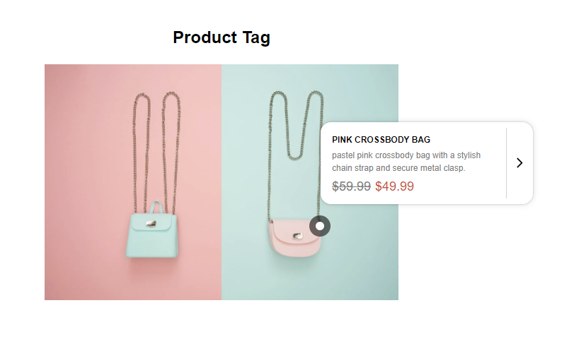
The Product Tag adds a unique tag-like popup:
- Hotspot: A clickable area on the image.
- Popup Tag: When clicked, a tag-like popup appears with:
- Title: The name of the product.
- Description: A brief summary of the product.
- Price: The cost of the product.
- Link to Product: A clickable link to view or purchase the product.
9. Product Tile
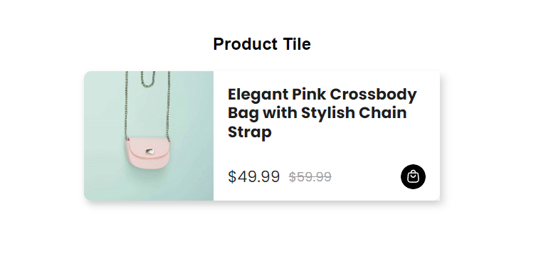
The Product Tile is a straightforward component with essential information:
- Title: The name of the product.
- Price: The cost of the product.
- Shop Now: A button to purchase the product.
Each of these components serves a specific purpose and can be utilized based on the level of detail and interactivity you want to provide to your users.
Explore the Products Feature
Discover how simple it is to showcase your products directly within the editor with our easy-to-follow demo.