Introduction
What is the Custom Component
With the Custom Component, you can create your own components. By taking the various tools available at Dot.vu, you can create bigger (and smarter) building blocks that you will be able to reuse on your projects. Here are some examples of compound components that you can build using the Custom Component:
- Flippable Images: You could have 1 image that is, when moused-over, flips to reveal a second image
- Image gallery: Rotating gallery of N images
- Games: Create games with Dot.vu components and pack them into a single component
- Infographics: Join several progress animation components to create an infographic component.
How can it help you in your creations
As you can see, the Custom Component can be used to create your own set of reusable components that you can use throughout your projects (or even repeated in a single project). Not only that, but you can also use the Custom Component to group common functionality from your project. If you are, for example, creating a game, the custom component enables you to have all data fields, triggers, and actions related to your game in a single place.
Now that you have all the logic for your custom component configured, if you want to duplicate the same behavior/design in another part of your project, you can simply copy & paste it. All inner components, triggers, actions, data fields, and so forth will be duplicated. The same as if you were to copy & paste an ordinary component from the Building Blocks.
Having the ability to create your project in these building blocks, especially if you are developing a more complex project, enables you to stay focused on a single feature at once. If you are, for example, configuring a gallery component, you only see actions, triggers, data fields, and components from the gallery. This helps you avoid mistakes and be more productive.
Fundamental Concepts
Before diving deeper into how to configure the Custom Component, it is best to first describe some fundamental concepts required for you to take advantage of the Custom Component’s powerful features.
Outside and Inside editing
When you drag an Input Form Component to your page, you cannot access its inner components, so for that, you need to go inside it. This concept of configuring your Component from the outside or configuring your Component from the inside is essential.
You are working inside the Custom Component whenever you are to re-arrange its components, adding data fields, actions, triggers, etc. Whenever you want to see your Custom Component alongside your other page components, you are to see it from the outside.
Actions, Triggers, and Data Fields
When using any Component from the Dot.vu Building Blocks, you notice the Component lets you interact with it in several ways. For example, if you take the Youtube Component, you can use Actions to start, pause, or seek to. You can use “When reached time” Triggers to know when the video reaches a specific time. Finally, you can also use the “current time” data field to print the current time the video is playing. You can configure how the YouTube Component will appear on your page: show/hide controls, show/hide title, etc.
Any Component on Dot.vu is composed of these 3 concepts: Actions, Triggers, and Data fields. As expected, the Custom Component also lets you create your own Actions, Triggers, and Data Fields that can be used from outside to interact with. If you are building a Game, you might need to have a data field for storing the user score. Generally, you would add that into the Session Data, but with the Custom Component, you can now add that data field inside the Custom Component you are building. The same goes for Actions and Triggers. You might need a “Start Game” action or even a “Game Lost” trigger.
Scoping
Scoping refers to what components, triggers, data fields, and actions you can see/have access to. Up until now, all components on Dot.vu were part of the global project scope. This means that regardless of where you are configuring your page, you can have access to everything. At the same time, you cannot have access to see other project components.
The Custom Component also creates its own scope. When you configure your Custom Component, you only have access to components, data fields, triggers, and actions you added inside it. You will not have any access to, for example, the Page, Session Data, or Addons. In the same way, if you are configuring your project outside the Custom Component, you will not see anything inside the Custom Component. Hence the need for configuring what goes in and what goes out – that is described and the output for the Custom Component.
Output
The output for the Custom Component refers to all the settings, actions, triggers, and data fields you can use to interact with the Custom Component. All triggers, actions, and data fields created inside the Custom Component are private by default – meaning they are only to be used inside the Custom Component. If you need access to a data field outside the Custom Component, you need to “export” it first. The output of a component is in the same way as any Dot.vu Component is the set of all settings, actions, triggers, and data fields you can use to configure it.
It is essential to think deeply about what is needed to be outputted from the Custom Component. If we output everything, we lose scoping on the Custom Component, making it harder to reuse and configure. In the same way, having a Custom Component with nothing outputted means there is no control to configure it from outside.
Configuration
This section of the article will be described the various ways of configuring the Custom Component.
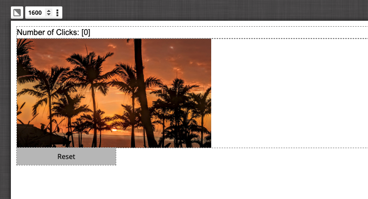
To better understand how to work with the concepts of the Custom Component, we are going to build a component with the following features:
- An image is going to be presented
- Whenever the image is clicked 5 times, a “Game End” Trigger will be fired.
- A “Reset” Action will be used to reset the image clicks.
- The number of clicks will be available to be used from the outside.
How to add the Custom Component to your project
As with all Components and Addons from Dot.vu, to add the Custom Component to your project, go to the Building Blocks and search for “Custom Component”. Once you have found it, drag it into your page.
Empty Settings when you drag the Custom Component to your project.
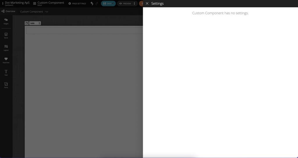
When the Custom Component is added, it will open its settings automatically. Right now, the settings are empty. Later on, you will learn how you can design your Custom Component’s settings. You can exit the Settings by clicking on the Editor.
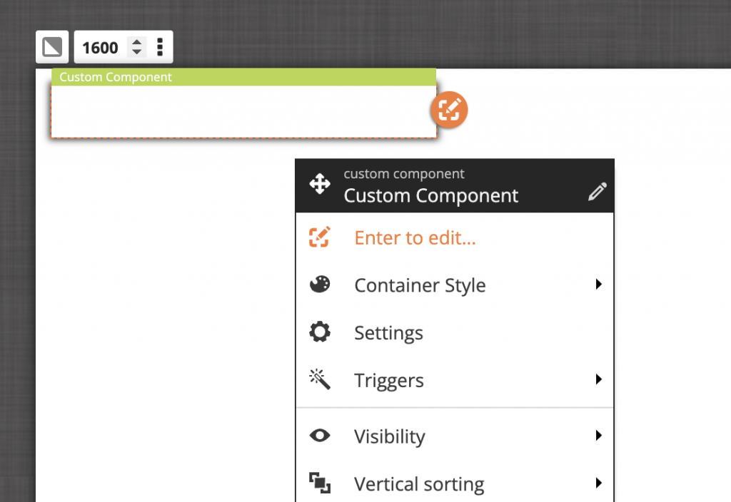
The Custom Component is now added to your page, but it’s blank. To start configuring it, you need to go inside it. This can be done by double-clicking the component or selecting “Enter to edit…” from the Component Menu options.
Inside Settings
After going inside the Custom Component, you might see the similarities between the Custom Component and the Stages Component. Indeed they are quite the same, with some fundamental differences:
- Anything you add inside the Custom Component will not be accessible from the outside
- You will not be able to find anything from outside the Custom Component
- There is an extra setting for configuring the Data Fields, Actions, Triggers, and the Output of the Custom Component.
Adding Components
As explained earlier, the Custom Component behaves similarly to the Stages Component. You can create multiple stages and add any components to it from the Building Blocks.
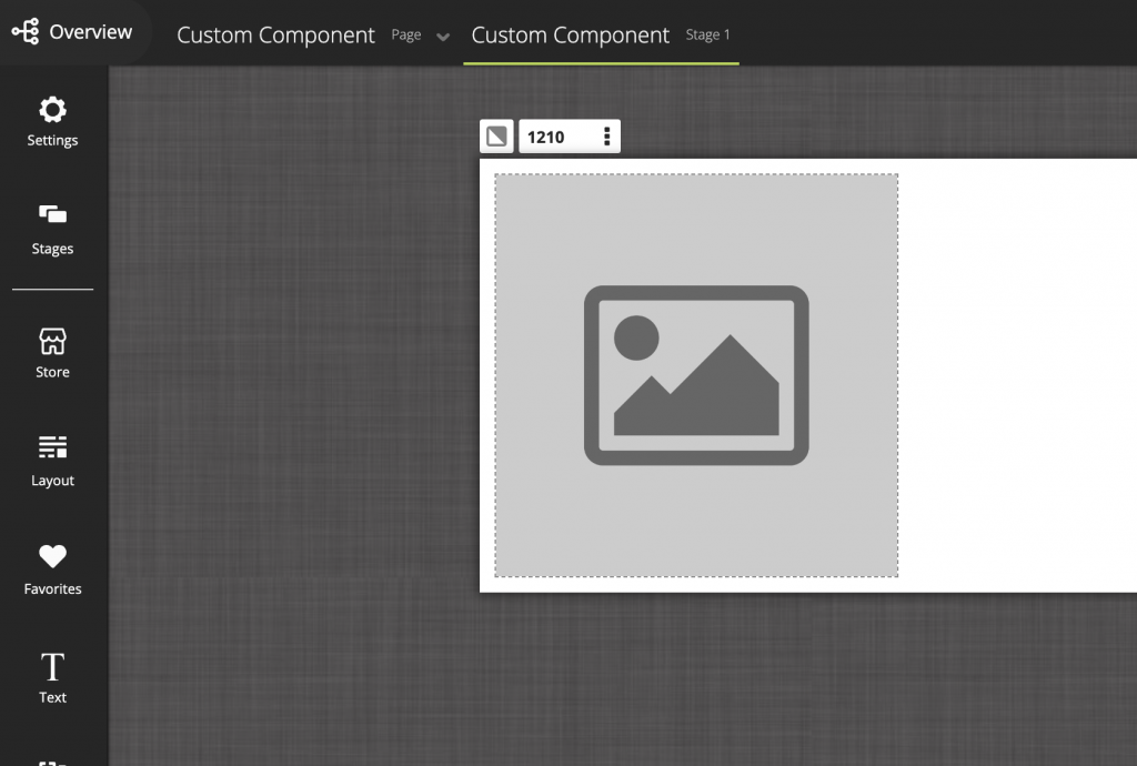
For example, to add an Image, simply search for it in the Building Blocks and drag it to your Custom Component.
How to add Actions, Triggers, and Data Fields
Now that you have played around with adding Components inside the Custom Component, we will explain how you can add Actions, Data Fields, and Triggers to your Custom Component. To access any of these features, you first need to go to the Custom Component’s Settings. Access it by clicking on the “Settings” icon in the left sidebar.
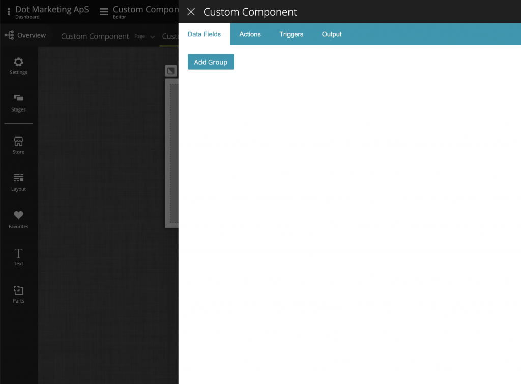
Add Data Fields
Located in the first tab of the Custom Component’s inside settings, the Data Fields work the same way as the Session Data Fields. You first create groups to organize your Data Fields and then add as many Data Fields as necessary. Each Data Field, as usual, has a name, type, and optional default value.
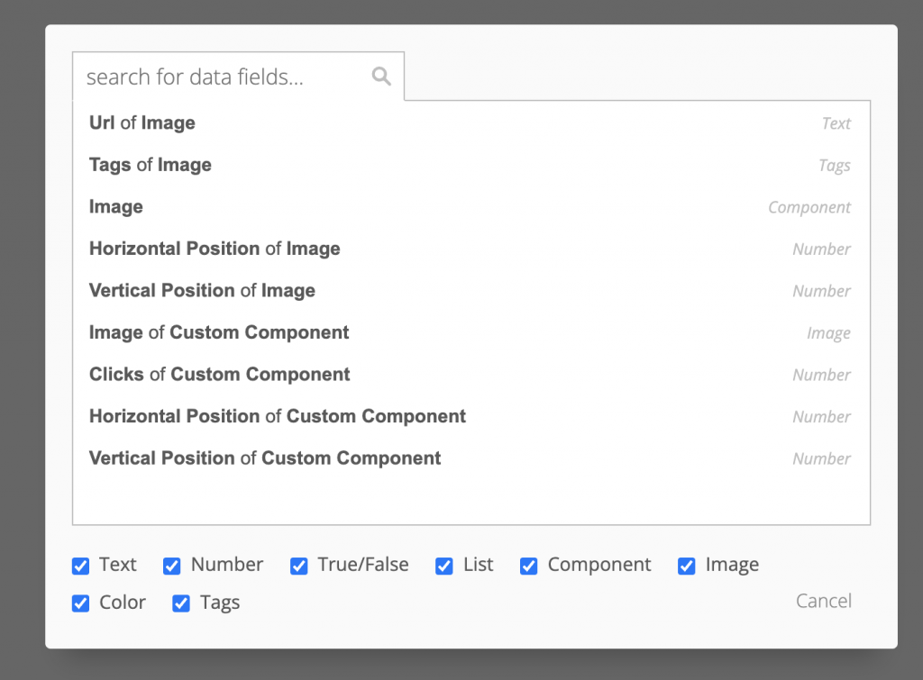
You can now bind this newly created Data Field and set it as the image source for your Image Component. To do it, go to your Image Component and select the Data Field you just created. While on the Data Field Selector, notice the very few options of Data Fields available for you to choose from. This is because it is not possible to access Data Fields outside the Custom Component.
Add Actions
Next, we are going to create an Action to reset the clicks counter. To do that, go to Custom Component Settings, “Actions” Tab.
Next, click the “New Action” button and set its title, description, and Action Set. In our case, we want to set the “Clicks” Data Field with 0.
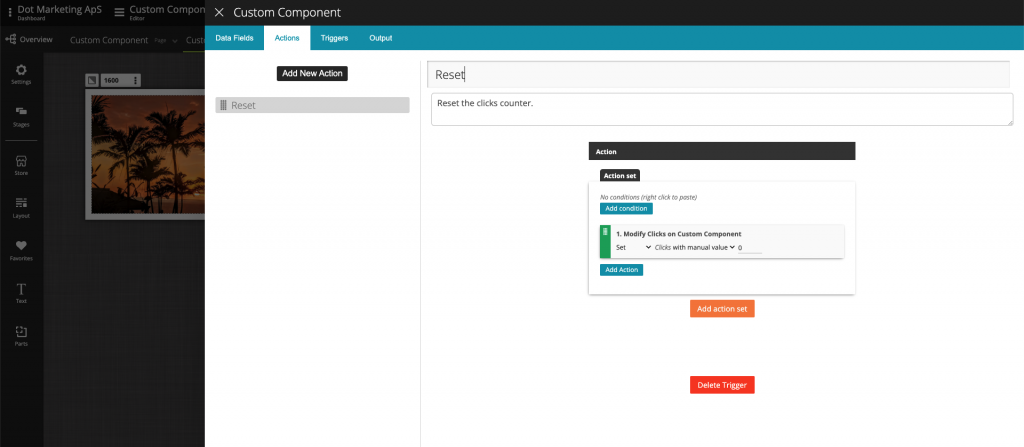
Since the “Reset” Action is only going to be used from the outside, there is nothing left to configure from the inside. Later on, we will output this Action so that it can be accessed from outside. Remember, everything you add to your Custom Component is private by default!
Add Triggers
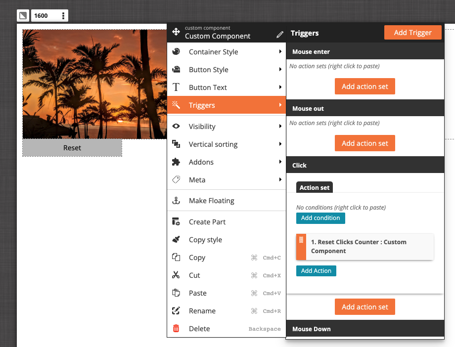
We are now going to add our “Game End” trigger. But, before we do that, it is essential to explain the concept behind triggers.
Triggers are used by Components to tell you when something happens inside them. For example, a button will give a trigger, which you can use to know when a user clicks on it. More complex Components can give you more detailed triggers – a Reveal Component will provide a trigger, to let you know when the user has scratched all the way through.
When creating a Trigger inside the Custom Component, 2 steps need to be configured:
- Create the Trigger
- Fire the Trigger
The first step is clear. If we want to create a new Trigger, we need to do that. But once it is created, we need to tell it when it should be triggered (fired). This is why, for each Trigger you create, the Custom Component will create a “Fire trigger…” Action. Whenever this Action is run, the trigger will fire.
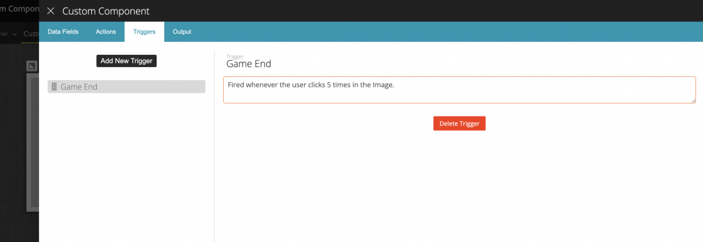
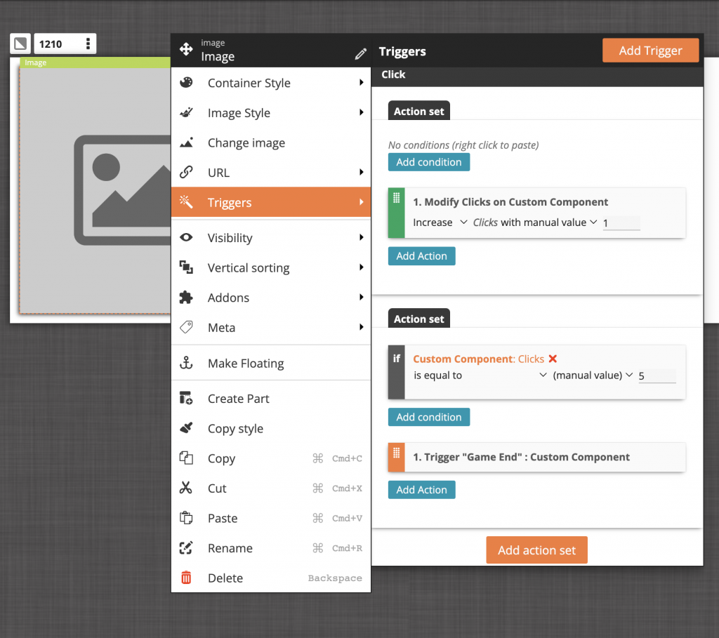
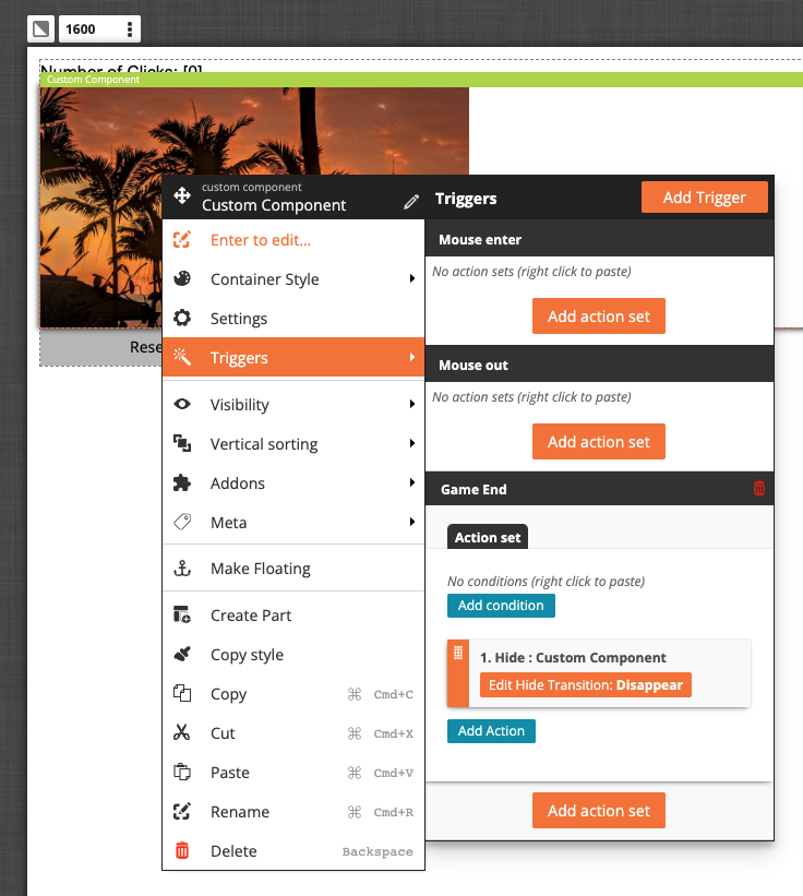
In our case, we want to fire the “Game End” trigger when the user has clicked the 5th time in the Image. To do that, go to the Image Component, click “Triggers” and inside the “Click” Trigger add the following configuration:
- Increase the “Clicks” data field with 1.
- Add another Action Set and use a condition to check if the “Clicks” data field is equal to 5. If yes, then run the “Trigger Game End” Action.
Again, notice that when adding actions in the Custom Component, there are very few Actions to choose from. Only Actions from inner components are shown.
Output Settings
Now that the overall functionality of our Custom Component is done, we need the following features:
- Should be able to configure what image to use
- Should be able to have access to the “Game End” Trigger
- Should be able to have access to the “Reset” Action
- Should be able to have access to the “Clicks” Data Field.
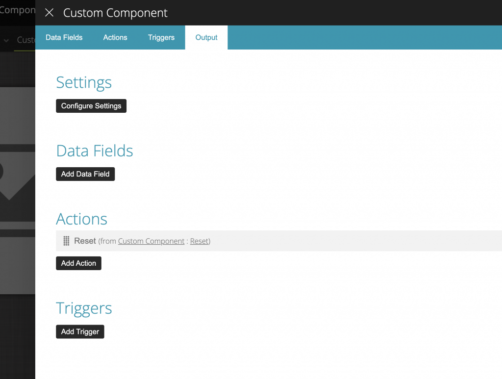
If you leave the Custom Component, back to your page, and try to search for the “Reset” Action, nothing is shown. This is what the Output setting is used for. Whatever Actions, Data Fields, and Triggers you defined in the Custom Component Settings if you want those to be accessed from outside, you need to define them in the Output setting.
To access the Output Setting, go inside the Custom Component, click on its Settings, and then in the “Output” tab.
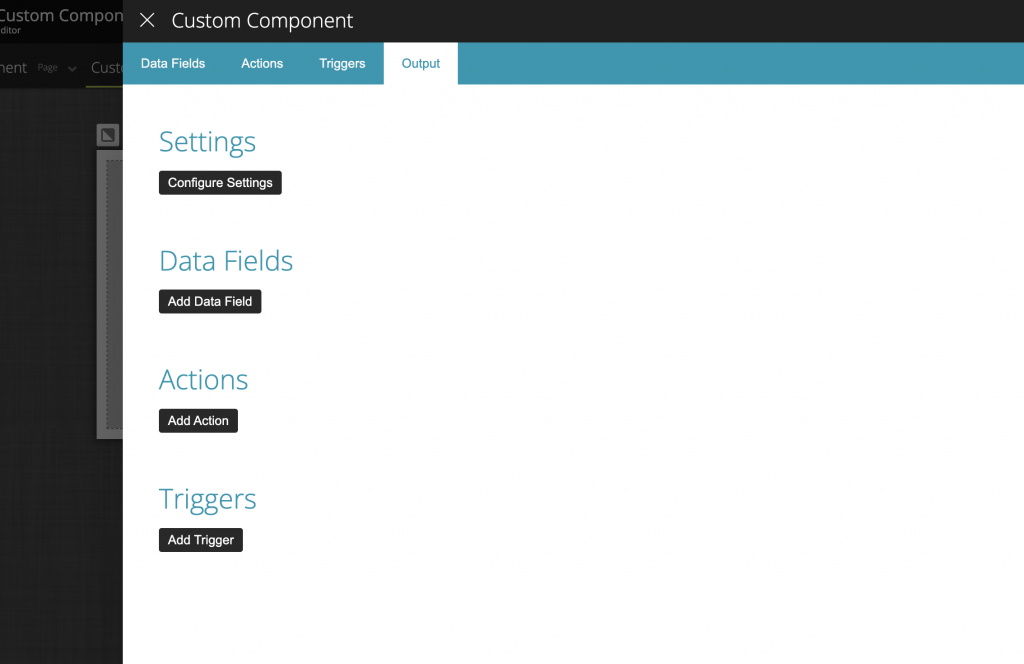
Output Actions
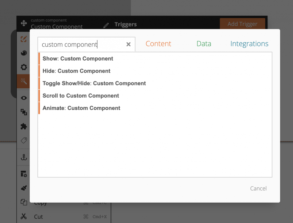
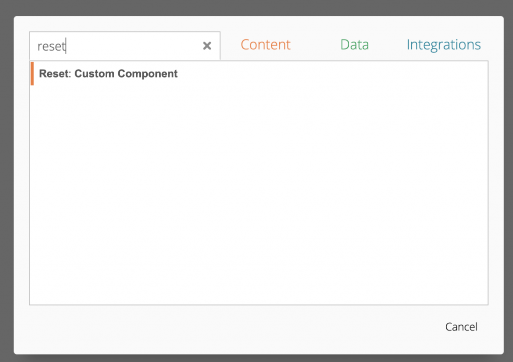
To output, our “Reset” Action click on the “Add Action”. Search for “Reset” and select it.
After selecting the “Reset” Action, notice a new line in the Output Setting.
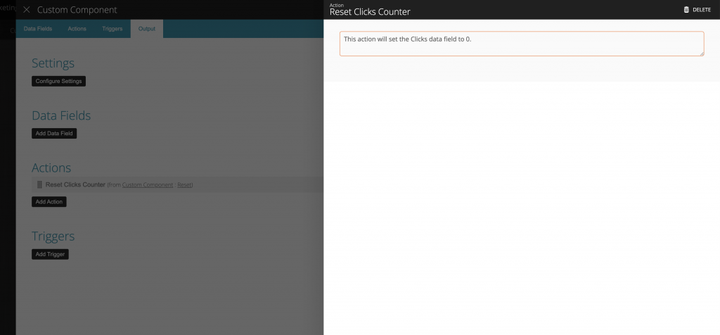
Now that the “Reset” Action is outputted, we can rename it so that it makes more sense for outside usage. To change its name and description, we click on the Action to access its Settings. The name and description will only apply to the outside. Inside, the Action is still going to be named “Reset”. Let us rename it to “Reset Clicks Counter”.
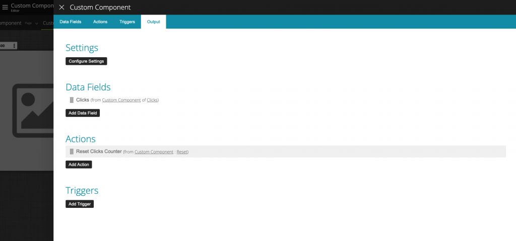
Output Data Fields
Similar to Actions, to add output Data Fields click on the “Add Data Field”. Next, search for “clicks” and select it.
You can also change the name of the output version of the “Clicks” Data Field. This time we are going to leave it with the same name.
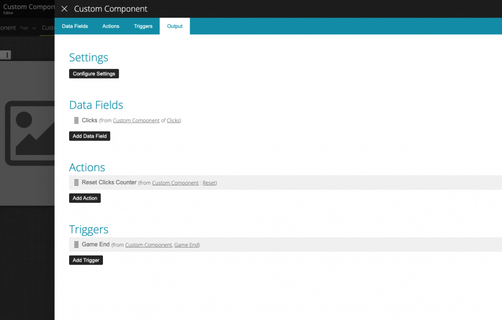
Output Triggers
Finally, we will output our “Game End” Trigger. The same steps performed when adding the Actions and Data Fields are needed to output Triggers.
Click on the “Add Trigger” button, search for “Game End” and select it.
Output Actions, Triggers , and Data Fields from inner components
As described earlier, an important concept to understand is that you can also output Actions, Triggers, and Data Fields from components inside your Custom Component.
Let’s say you wanted to use a Text Input Component inside your Custom Component and wanted to output the Answer’s Data Field. You don’t need to create a Data Field on your Custom Component, sync it with the Text Input’s Answer and Output it. A much easier way is to simply output the Answer’s Data Field from the Text Input Component. Whenever you click “Add Data Field”, “Add Trigger” or “Add Action”, inside the Output setting, you can choose from all options available from both the Custom Component and its inner components.
How To Create Your Custom Component Settings
The last step in configuring our Custom Component is to create a setting that shall be used outside so that you can configure the image you want to use. Such as, the Image Component lets you define the image you want to use, and the Custom Component should have the same requirements.
The Custom Component features a very customizable Setting Designer. You can create as many tabs as you want. Inside each tab, you then create sections. Finally, inside each tab’s section, you can add data fields as settings.
This time we will keep it simple and add just 1 tab, 1 section, and 1 setting.
To access the Settings Designer, click on the “Configure Settings” button.
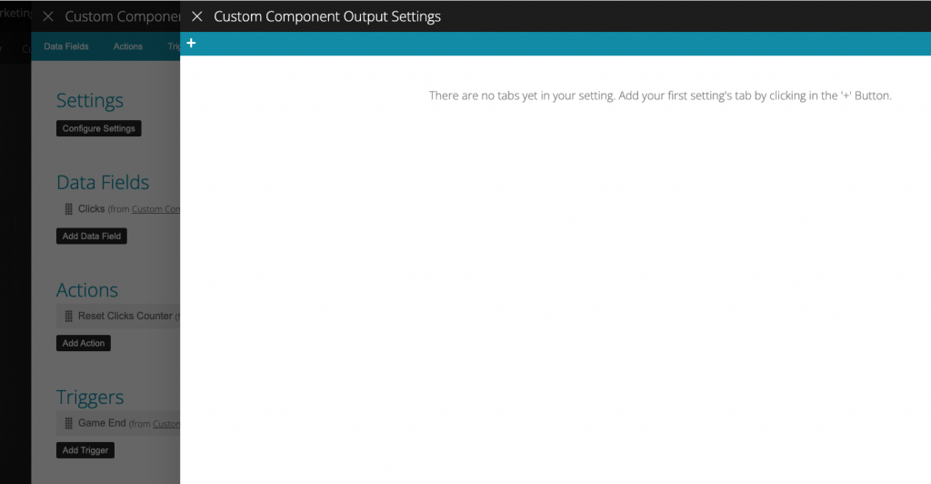
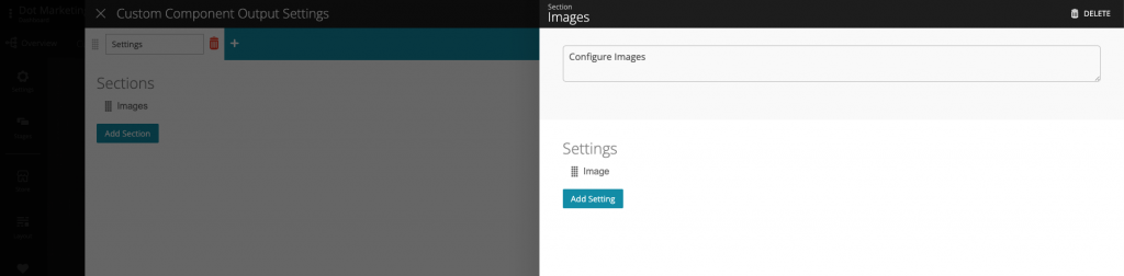
First, create a tab by clicking on the ‘+’ button located in the top bar. Give it a “Settings” name.
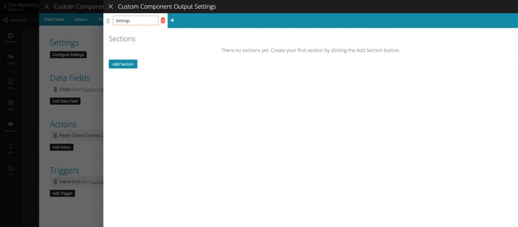
Create a new Section by clicking on the “Add Section” button. Then, click on it to edit it and give it a name and description.
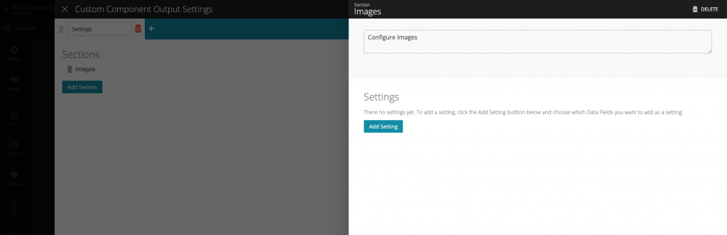
We can now add our image setting, which will be tied to the Image Data Field we created. To do it, click on the “Add Setting” Button, inside the Section setting.
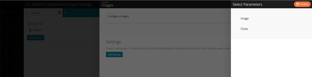
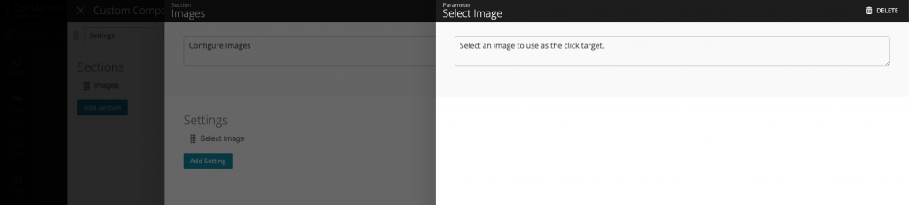
A Select Parameters slider appears where you can choose from any data field you added to your Custom Component. Select “Image”.
Now that you have added the “Image” data field to the section, you can click on it to change its settings. Let’s change the name and description.
Outside Settings
Now that we have configured the outside settings of our Custom Component, let’s go back to our page to see how the settings are presented. To access the outside settings of the Custom Component, click on it (from outside), and in the Component Menu select “Settings”.
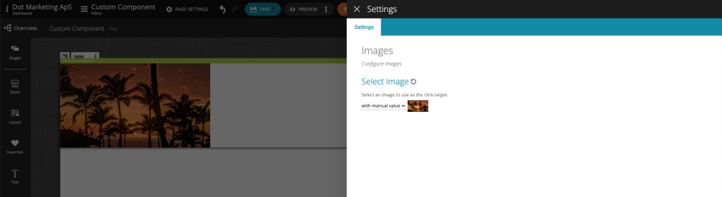
As you can see, we have a “Settings” Tab, an “Images” section, and finally, our “Select Image” parameter, which in reality is the “Image” Data Field.
For all data fields added in the outside setting, you can:
- Choose a manual value
- Choose a value from a data field
- Reset the setting to the default value.
Using the Output Actions, Data Fields, and Data Fields
Now that we have configured all the output options we want to use from outside, let’s close the cycle of building the Custom Component by using it on our Page.
Using Output Actions
The first step is to use the “Reset” Action. For this, we are going to add a Magic Button Component, and when it is clicked, we will run the “Reset” Action. Your configuration should look like this. Notice that the “Reset” Action is actually called “Reset Clicks Counter” from the outside.
Using Output Data Fields
Next, we are going to print the “Clicks” Data Field. This can serve as the status for our game. To do that, you should drag a Text Component from the Building Blocks, and add the “Clicks” Data Field.
Using Output Triggers
To finalize this tutorial, we are going to use the “Game Ended” Trigger. For simplicity, when the “Game Ended” is fired, we are simply going to hide the Custom Component. In a more realistic scenario, this trigger could be used to go to another stage or run a Draw.
To add the “Game Ended” Trigger, go to the “Triggers” menu of the Custom Component. Then, click on the “Add Trigger” button and search for “Game End”. When the trigger is added, simply add the “hide Custom Component” Action.
Conclusion
After following the instructions, you should be able to preview your Custom Component, click on the image, reset the counter, etc.
Also, if you try to copy & paste the Custom Component, you will see that everything will still work on the copied version. All layout, configurations, output settings, and so on are duplicated.
By following this help article, you will better understand the advantages of using the Custom Component and how you can use it to create your own Custom Components.