You can embed Interactive Experiences you create on Dot.vu onto your Website or Blog.
To embed a Dot.vu Interactive Experience, all you need to do is configure how you wish to embed, and then copy and install your project tag.
What’s A Tag?
A tag is an easy-to-install powerful piece of code that enables a variety of features on your site, such as dynamically deploying Interactive Experiences!
Installation is a one-time process, either through your website’s Content Management System (CMS), such as Joomla or WordPress, or via a Tag Management System like Google Tag Manager.
When To Use Project Tag?
A Project Tag is a quick way to embed an individual Interactive Experience anywhere on your site. If you’re just getting started or just want an easy solution, the Project Tag is what you want.
However, if you would like manage embedding multiple experiences from a single dashboard and use location controls checkout the Site Tag.
How To Embed With Project Tag
- Go to your Dot.vu account and edit the project you wish to embed.
- In the Dot.vu Editor, click Put On Website
- Configure how you wish to embed – see embed settings
- Copy the Project Tag provided and install it on your website.
Your project tag will vary per project and embed settings, and it will look something like this:
<div id="dot-074289b9-5a37-41d0-9827-0954762c2a50"></div>
<script type="text/javascript">
!function(d,o,t,v,u){var l="dataLayer";d[v]=d[v]||function(){(d[v][l]=d[v][l]||[]).push.apply(d[v][l],arguments)},d[v][l]=d[v][l]||[];var s=o.createElement(t),f=o.getElementsByTagName(t)[0];for(var k in u)Object.prototype.hasOwnProperty.call(u,k)&&(s[k]=u[k]);f&&f.parentNode?f.parentNode.insertBefore(s,f):o.head.appendChild(s)}(window,document,"script","dotVu",{async:!0,src:"https://cdn.dot.vu/core/dot.js"});
window["dotVu"]({ eventType: "init", accountId: "123" });
window["dotVu"]({ eventType: "projectLoad", accountId: "123", details: { "config" : { "dotId": 123, "pageId": "65d47dac6c434c65192a57c3", "projectTitle": "example" }, "options": { "type": "inline", "height": "auto", "width": "100%", "selector": "#dot-074289b9-5a37-41d0-9827-0954762c2a50" }}});
</script>
Embed Types
With Dot.vu, you are able to embed your projects in 2 distinct ways:
- Inline: Your Dot.vu project will be embedded in a predefined slot on your website. Your content will, therefore, be inline with your website.
- Popup: Your Dot.vu project will be embedded as Popup on your website. When embedding your project as a Popup your content will always show above your website. You will also have the ability to configure when your Popup shall be shown using Triggers.
Inline Embed Settings
There are a few settings available to customize how your Interactive Experience is embedded.
Width, Height and Ratio
As different Interactive Experiences occupy screen space differently, you must configure the Width, Height and Ratio based on the type of Interactive Experience you are embedding:
The Height Changes
In most Interactive Experiences, the height of the content can vary while a user interacts with it. For example, going from a quiz question with four answers to a question with five answers, or from spinning a wheel of prizes to filling a prize win form. If you embed an experience with changing height, we recommend:
- Width: 100% – you can change this as desired
- Height: blank – defaults to ‘auto’
- Ratio: blank – defaults to ‘auto’
Always Same Ratio
If you wish to embed an experience that always has the same aspect ratio, such as a single Interactive Video or Interactive Image, or an experience built around the Ratio component, or a banner ad with a fixed width and height, we recommend the following configuration:
- Width: 100% – you can change this as desired
- Height: blank – defaults to ‘auto’
- Ratio (%): the ratio of your content in percentage. For example a video with a ratio of 16:9, would be 9 / 16 = 56.25% ratio (height divided by width). This way, the height of your content will always be determined by its width.
Occupy The Whole Screen
Some experiences such as the Interactive Flipbook are made to occupy the full height of the screen of whatever device being used. For these experiences we recommend:
- Width: 100% – you can change this as desired
- Height: 100vh – you can lower this slightly if needed
- Ratio (%): blank – defaults to ‘auto’
None Of The Above
If you don’t think your experience does not fit any of the described above, go with The Height Changes. If you still have issues embedding, then please contact our support via LiveChat.
Popup Embed Settings
When choosing to embed your project as a Popup, there are several options available to customize its presentation and behaviour.
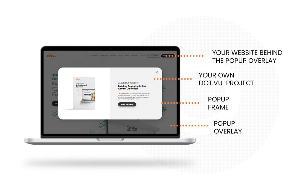
Popup Anatomy
For a better understanding of the various configuration options of a Popup, please see the below image.
Position and Size
Configure where your Popup will be shown on your website.
- Horizontal and Vertical: Choose where your Popup should be shown. You can choose between any of 9 combinations of horizontal and vertical settings
- Offset: Give the original position of your Popup, defined in the horizontal and vertical settings, choose if you want to offset the position of your Popup.
- Width and Height: Select what shall be the size of your Popup. On any of these settings you can leave blank for an “auto” behaviour. When selecting “auto” your content will determine the size of the Popup.
- Max Width and Max Height: Optionally, select what should be the maximum width and height of your Popup. This is usefull if you, for example, have selected the width and height of your Popups in relative units (%, vh or vw) but on bigger screens you want to select a maximum width and/or height.
Presentation and Style
Configure how your Popup will look on your website.
- Background Color: Select the background color for your popup.
- Shadow: Add drop shadow effects to your Popup frame
- Border: Add a border to your Popup frame.
- Overlay: The overlay is the layer behind the Popup. When a Popup is shown there is a layer behind it that covers the whole website. Depending on the Gating Strategy you can choose the overlay to be completely transparent and to not block the interaction with your website, or you can choose to completely hide and block your website.
- Gate: Select which gate strategy you want to apply to the Popup.
- Popup Focus: Whenever the Popup shows, your website will be blocked from interaction but the user will be able to click the background overlay at anytime to close the Popup.
- Soft Gate: Whenever the Popup is shown, the user will still be able to interact with your website. However, only the Embedded Experience will be able to close the Popup.
- Full Gate: Whenever the Popup is shown, your website will be blocked from interaction and only the Embedded Experience will be able to close the Popup.
- Color: Select what should be the color of the Popup overlay. For better UI/UX, we recommend choosing the color based on what type of gating was selected.
- Gate: Select which gate strategy you want to apply to the Popup.
- Animation: Optionally choose the animation effects for when your Popup is shown and hidden.
Customize Triggers
Since a Popup starts hidden, we need a way to show the Popup. The Popup Triggers, are conditions that once met they will show your Popup. Bellow is a list of all Triggers you can use to show your Popup.
- Exit Intent: The Exit Intent Trigger will show the Popup when users move their cursor toward closing the tab.
- Scroll Percentage: The Scroll Percentage Trigger will show the Popup whenever users scroll your site past a predefined percentage.
- Scroll to Element: The Scroll To Element Trigger will show the Popup when a predefined element of your site appears in your users’s viewport.
- Time: The Time Trigger will show the Popup whenever a user has been on your site for predefined amount of seconds.
- Click: The Click Trigger will show the Popup when a user clicks on predefined element of your site.
Given the most common cases, we have configured the triggers to have the following behaviour:
- If you select any of these triggers: Exit Intent, Scroll Percentage, Scroll To Element and/or Time; the popup will be shown whenever the first of these triggers fires. If any other trigger fires within the same session the Popup will not be shown.
- The Click trigger, which is bound to a button on your website, will always show the Popup.
Closing the Popup
As explained in the Popup Overlay section, you can use several gating options that modify how/if a user can close the Popup. If you select the “Full Gate” option, you realized there is no way the user can ever close the Popup. The only way to close the Popup is if your project closes the Popup.
In order for your project to close the Popup you need to use the “Close Popup” action from the Dot Library Addon. Using this action will enable any project to end the Popup flow. This is very useful if you are creating Interactive Experiences like Lead Forms, Quizzes, Guided Selling, or Games. To read more about the “Close Popup” action read the Dot Library Addon’s help article.
Other Embed Settings
Regardless of what type of embed you choose, there are general settings that you always have available.
Loading
You can enable a simple loading animation. The animation disappears once the Interactive Experience is loaded. If you are embedding using JavaScript, change the loading parameter from ‘off’ to ‘on’ to enable the loading animation.
Addon: URL Data
If your project uses the URL Data Addon, an extra section will appear where you can configure your Project Tag’s URL Data parameters. Here you can bind parameters either to host site query parameters, or a static value.
You can optionally manually set the “projectLoad” event’s details.config.urlData key value to include dynamic values set by your host site.
Addon: Data Store
If your project uses the Data Store Addon, an extra settings section is shown where you can configure a host site query parameter which your Project Tag will use as Store ID. Read more about it here.
Live Preview
To help you better design your embed, you can use our Live Preview feature.
When clicking on the Live Preview button, a new tab opens displaying the live version of how your project will look like using your embed settings. If you keep the Live Preview Tab opened, any changes you do on your embed settings will be automatically displayed in this tab.
The Live Preview Tab works with the latest published version of your project. This means that you won’t be able to use the Live Preview feature if you project is not yet published.
Q: What about Content Security Policy?
If your website has a Content Security Policy (CSP), please provide your Project Tag to the team responsible for managing your CSP. They may need to make CSP adjustments to allow your Dot.vu tags to execute correctly.
Q: What About Error Handling?
If an error occurs – for example, if you put a LIVE experience offline but forget to remove the tag from your website – the tag provides an API for error handling. See this article on how to handle loading errors.
Q: Can I Embed Multiple Experiences In One Page?
You can certainly embed multiple experiences in a single web page! This is common when you want, for example, to use Interactive Popups while at the same time embedding a guided selling experience.
Just repeat the How to Embed steps above for each project, or consider using a single site tag instead.
Q: What If I Need an HTML file?
If you wish to embed using a content distribution platform that supports embedding web content via an HTML file, such as Google Ad Manager, you can create a basic HTML document and simply include the provided tag.
Q: Do Viewport Units Work When Embedding?
No. Due to web technology limitations, if you set for example a component height or minimum height to be 80 vh (so 80% of the Viewport height) this would cause resizing issues. For that reason, Viewport units are disabled when embedding. Therefore:
- If you have a component with a height set with Viewport units, its height will instead be set to auto when embedding;
- If you have a component with a minimum height set with Viewport units, its minimum height will instead be set to 0 when embedding.